The identity design of Antara was done during an internship with Antara under the guidance of Sudebi Thakurata and Aparna Banerjee. Their blog defines Antara as, ” a space that is crafting experiences of learning from a variety of ‘signature pedagogies’. We are a team of artists, art practitioners, designers, educators, business re-engineering experts and corporate leaders who have come together to develop innovative approaches to learning, training and development, design-based innovation, documentation, planning and management. Antara is a not-for profit trust that serves team members who are part of the collective, and the community which it is located in, by providing a platform for learning, research, production and collaboration.”
I started redesigning Antara’s visual identity by studying the existing logo and the perception that people had about it. Then, I went ahead and made a list of words that Antara actually stands for and tried to get those in the new logo.
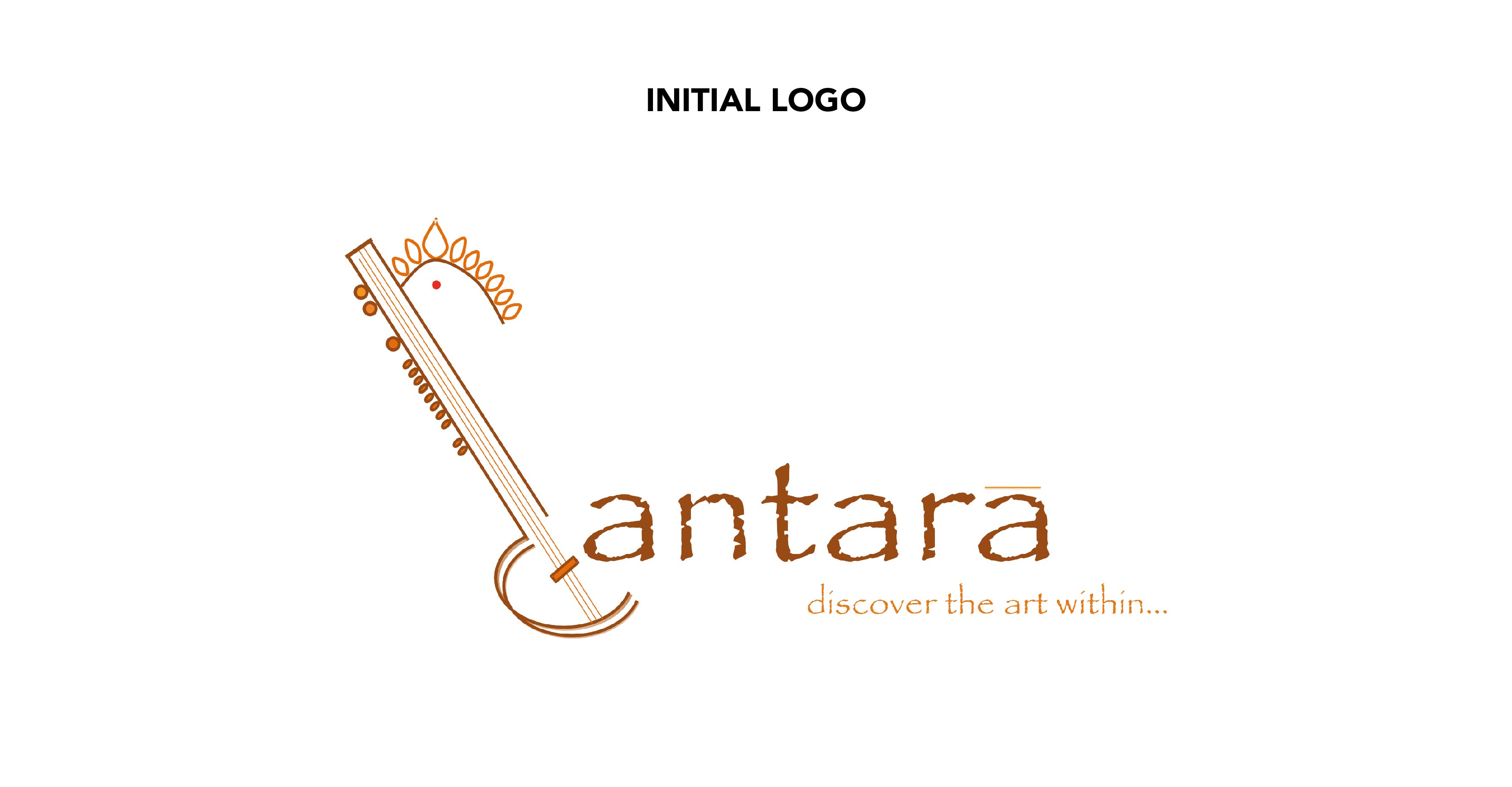
Antara’s Old Logo (Classical Music – Women – Identity – Culture – Indian)
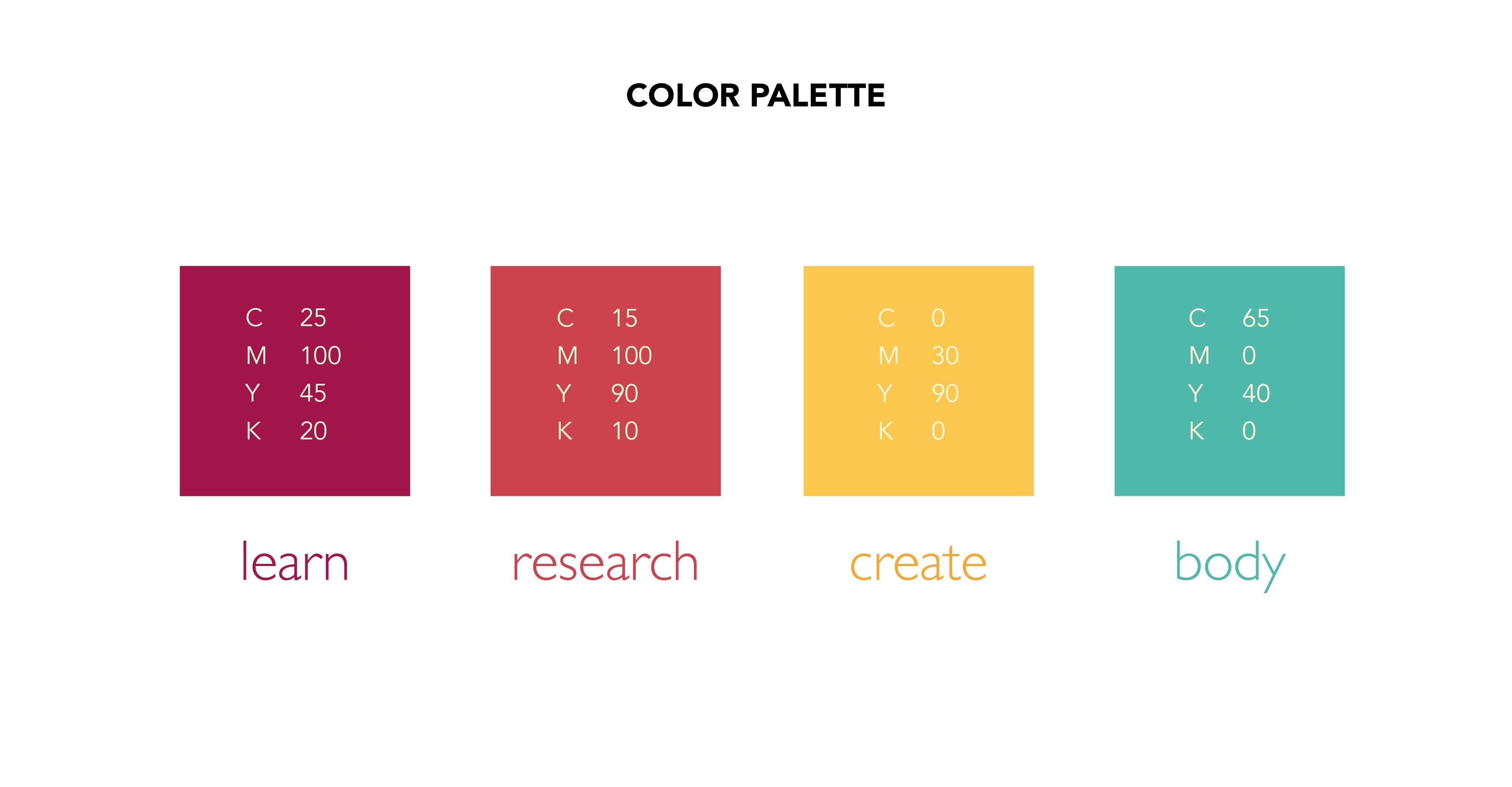
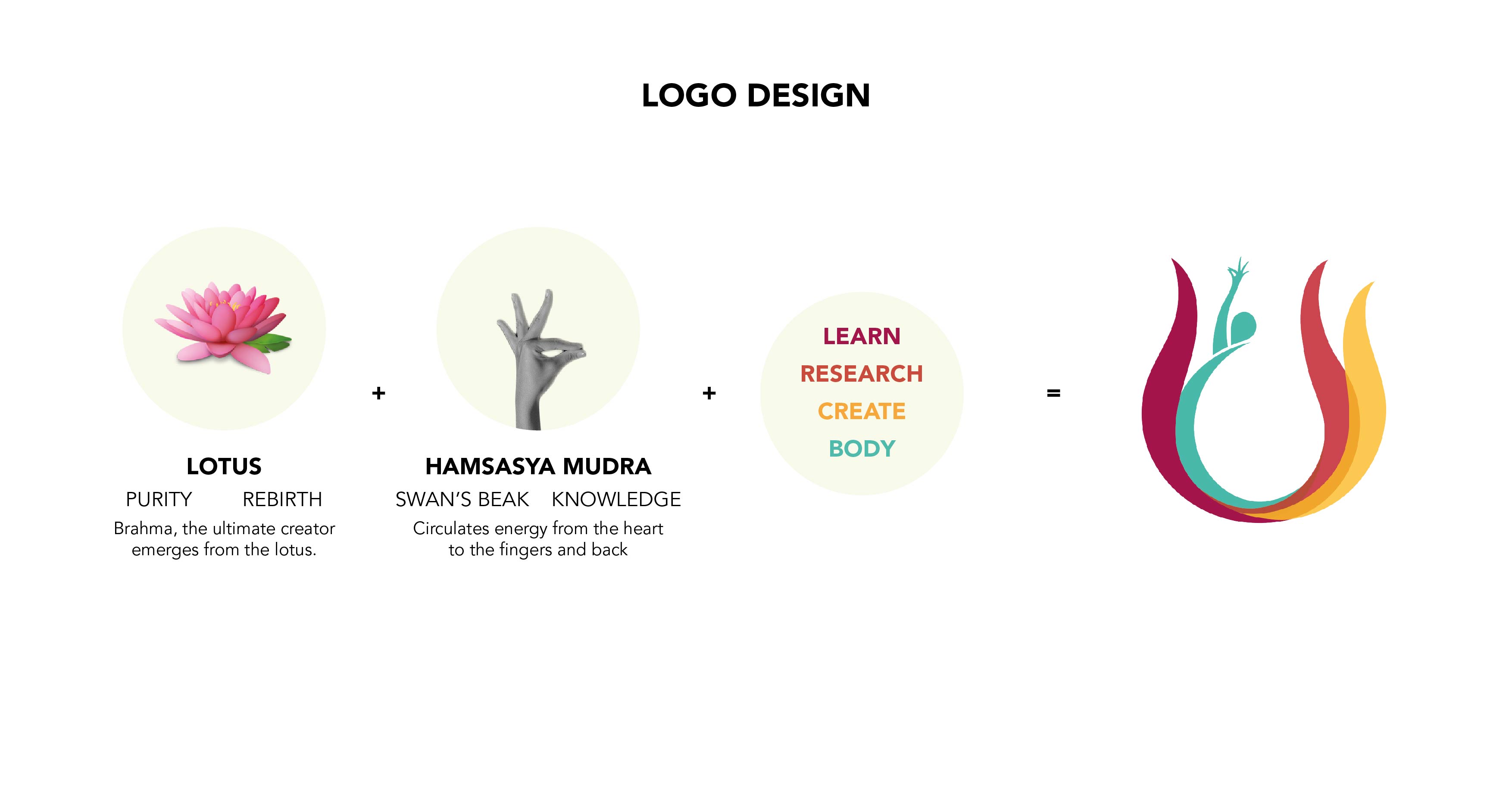
Interiority, learning space, experience, growth, engagement, transformation, creative freedom and performative practices were few of the keywords I focused on.
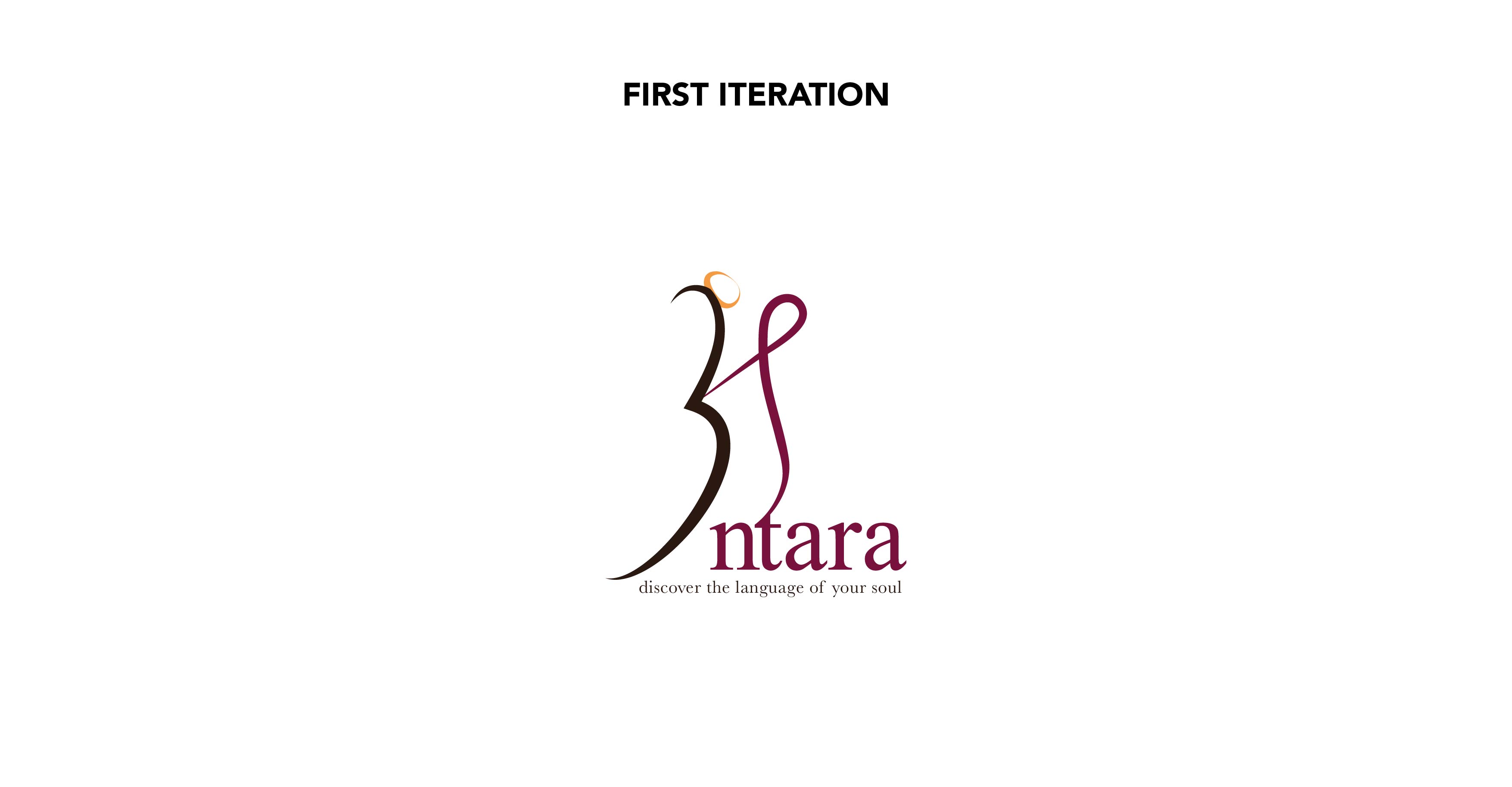
The form is organic and flowy to capture movement. The v has been modified to show two human forms (suggestive) and their interaction. The “.” on top of v has been added because that is how the first letter of the Antara is complete in Hindi.
![]()
![]()
![]()
![]()
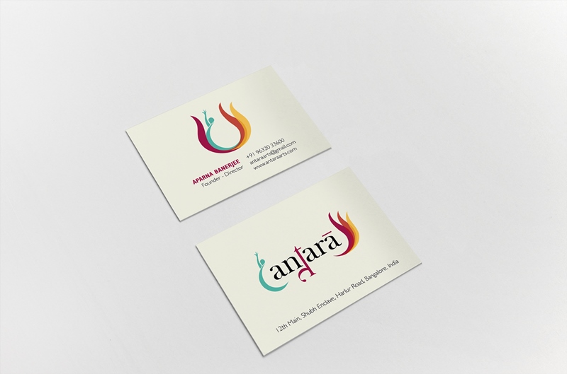
Visiting Card Iteration
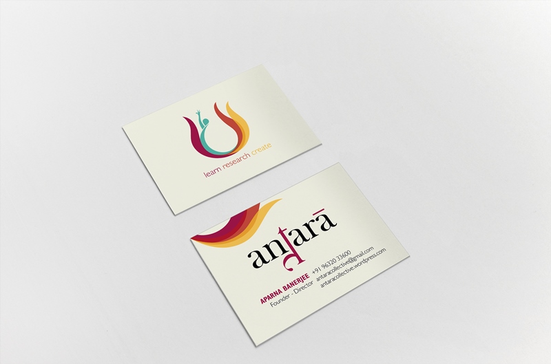
Visiting Card
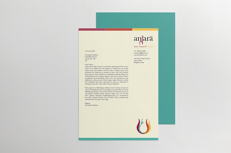
Letterhead Iteration
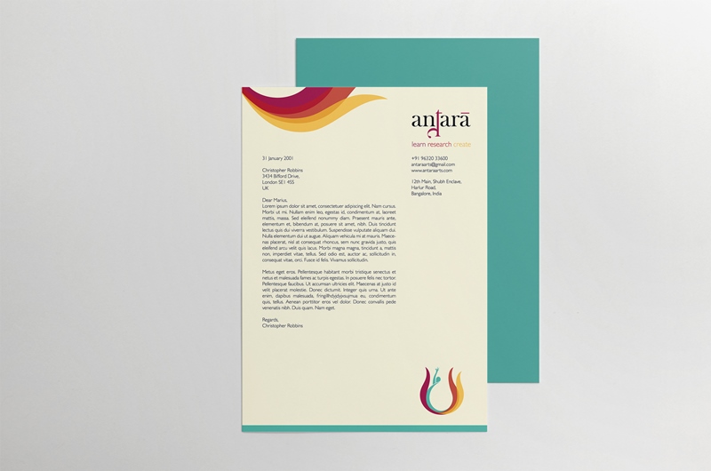
Final Letterhead
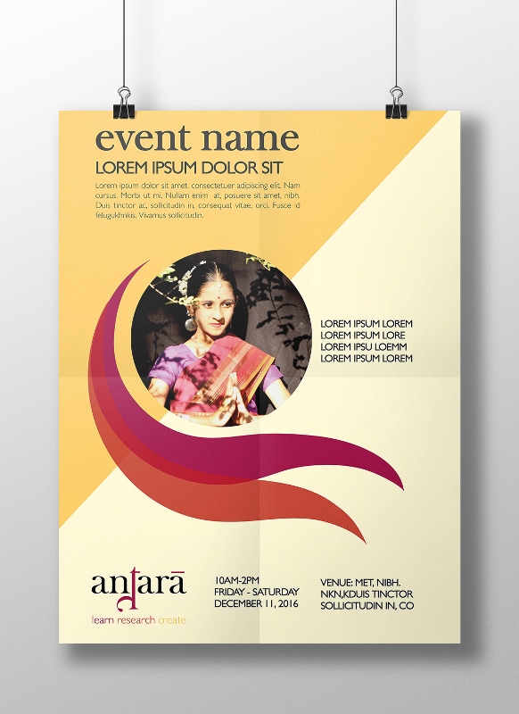
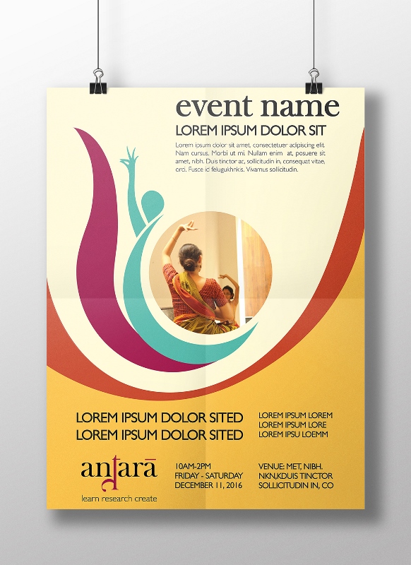
Poster Template (Learn + Research)
Poster Template (Learn)
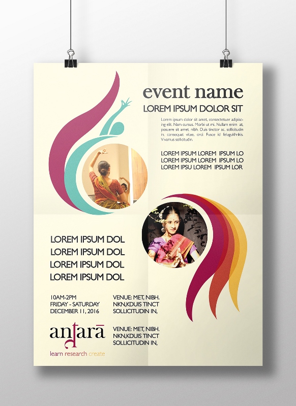
Poster Template for Collaborative Events
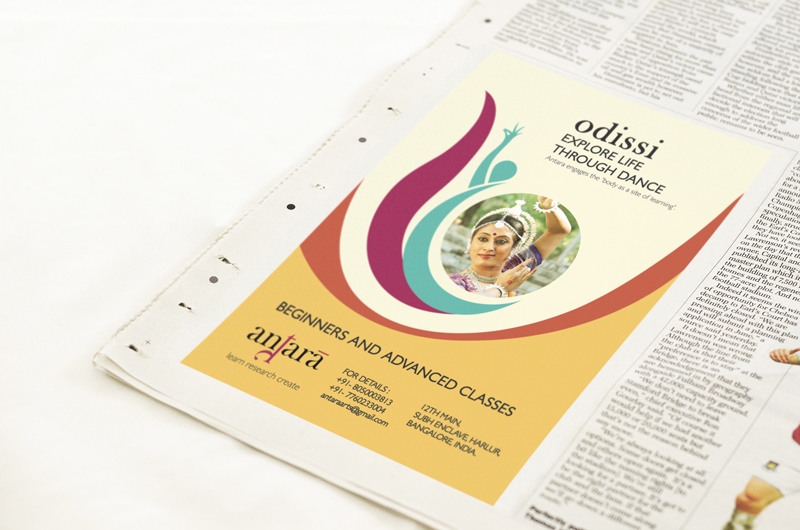
Odissi Classes Poster
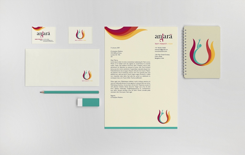
Antara Communication Materials