The Sakhi Saheli training manual was designed for the peer educators of the AAG (Action for Adolescent Girls) program for UNICEF. This project was done under the guidance of Lakshmi Murthy.
The Sakhi Saheli training manual includes 9 meeting sessions which are to be carried out by the peer educators with the adolescent girls. This project looked at designing the first five sessions. These meetings will be conducted for adolescent girls in villages of Rajasthan to empower and support them. The content of the training manual includes a variety of topics ranging from uplifting the confidence of the girls to providing them sex education.
The first iteration of the manual, that is, the first session, was designed based on secondary research. The focus here was on making the navigation through the manual simple and quick. The illustrations were direct and very straight-forward with realistic colours. Tabs were created in the manual.
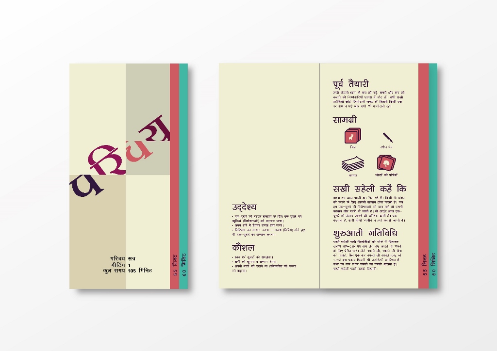
First Iteration used for Field Testing
The field testing was done at Udaipur, Mahida, Manpur and Khajuri (Rajasthan) with the cluster co-ordinators, peer educators, Sakhi Saheli’s and the adolescent girls. For effectively testing the manuals, we exchanged our manuals and tested someone else’s manuals and illustrations. The overall feedback was to use larger typefaces, and have as many illustrations as possible. They preferred A4 size manuals compared to other sizes. Use of bright colours was encouraged.
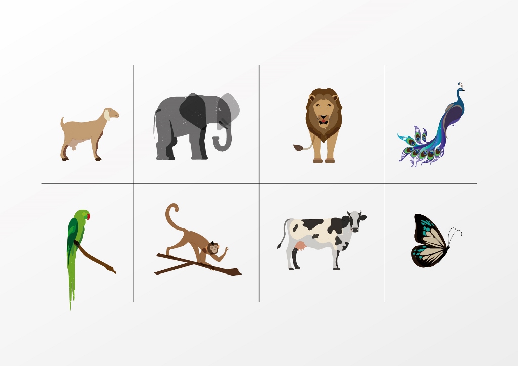
For the illustrations, the feedback was very detailed and specific. Realistic and detailed illustrations were preferred compared to abstract iconography. Coloured illustrations were more easily understood than outline drawings.
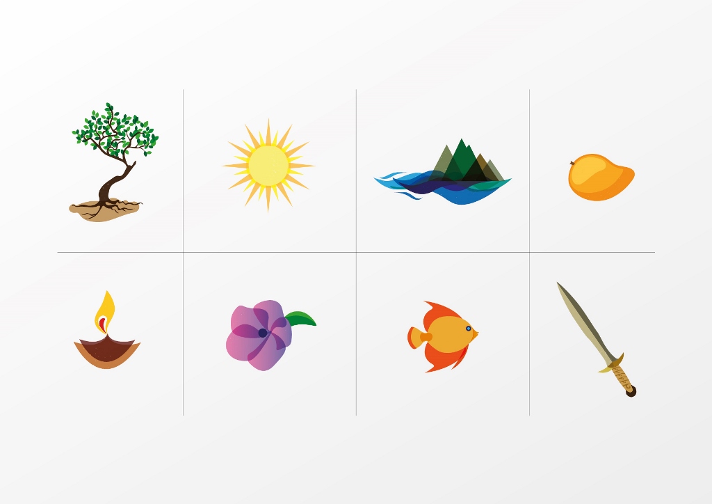
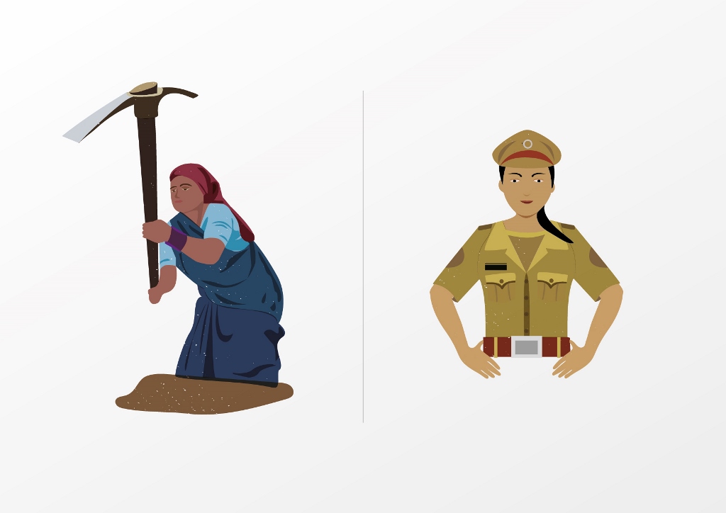
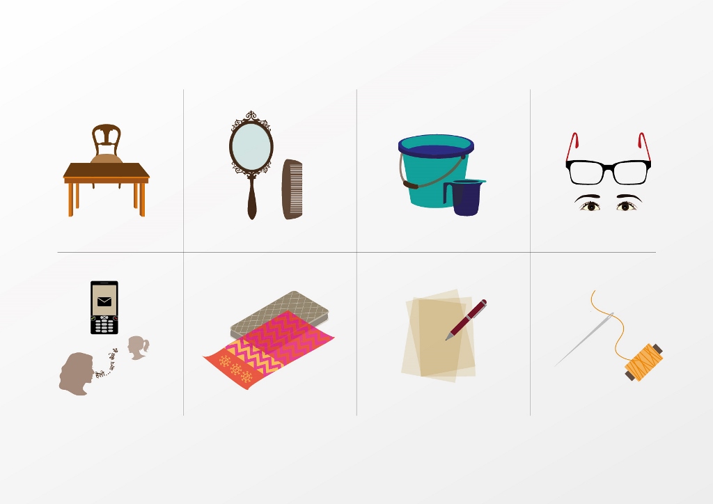
Feedback
The size and format of the manual was uncomfortable for the peer educators. They wanted an A4 instead. The tabs created in the manual was not understood by them. The colours and illustrations were appreciated. They did not understand the paper cutting icon with a pair of scissors along a dotted line which I had used around the illustrations for them to cut out. The type size was perfect for them and the layout was clearly understood.
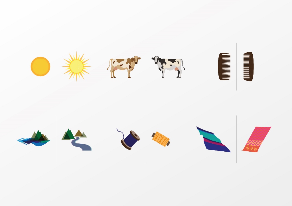
Few reworked illustrations based on the feedback
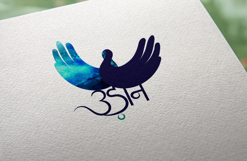
This AAG Project was named Udaan, which means flight. It refers to freedom, movement, growth and makes one think about happiness and dreaming big. The logo for Udaan had to be understood by the adolescent, the peer educator and the cluster co-ordinator.
Udaan Logo
I decided to use handwritten type along with two hands which represent a bird. The hands not only show the movement of flying but also signify that by working together the adolescent girls can fulfil their dreams.
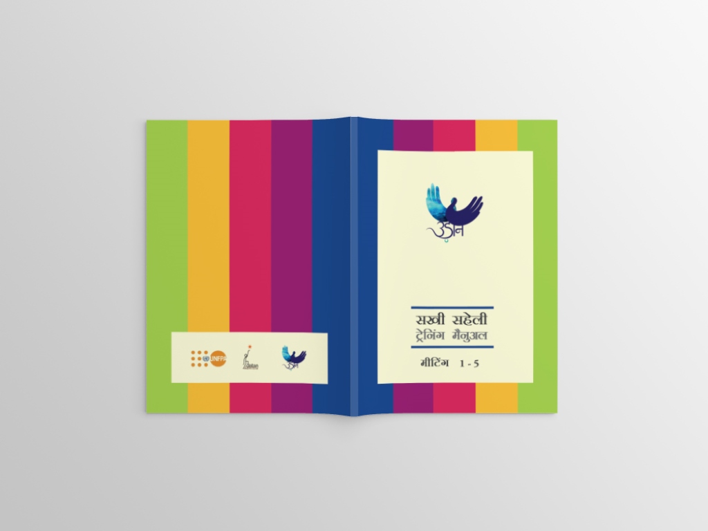
The training manual changed drastically after the field trip. The colour palette had become much brighter and each chapter had a unique colour scheme. The training manual, which then had 5 meetings is divided into sections which work as folders, showing an entire meeting as one colour segment making it extremely easy for the peer educator to navigate through the manual.
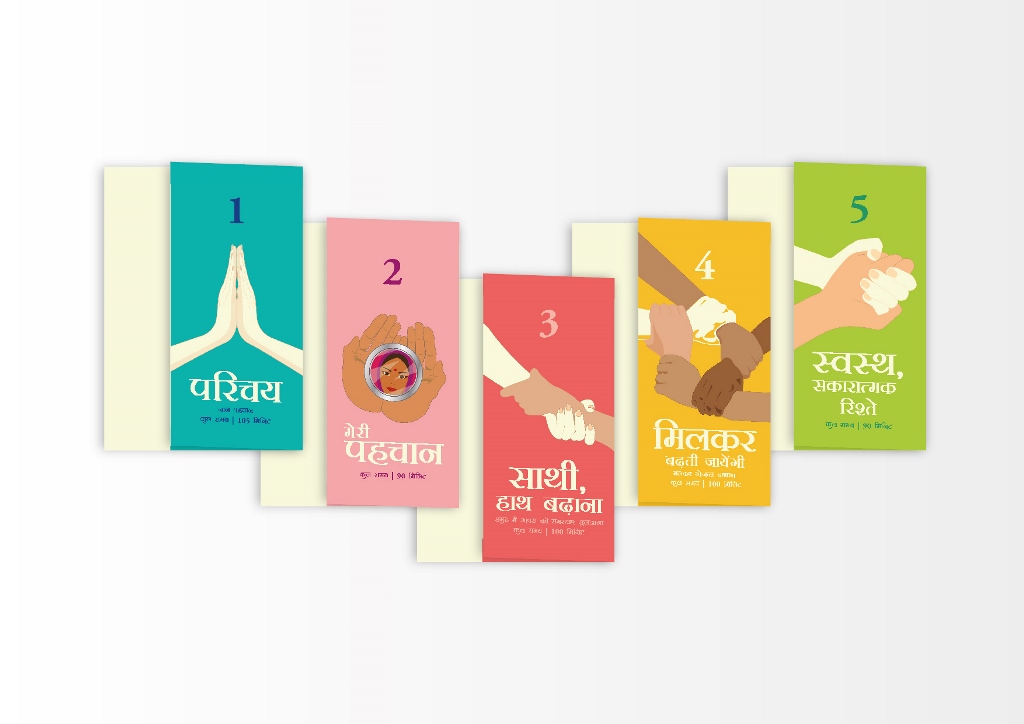
Meeting Folder Covers
The entire theme of the manual is based on hands and each meeting has a cover page with an illustration on it which can be easily understood by all the stakeholders. All the 5 meetings are bound to form the manual.
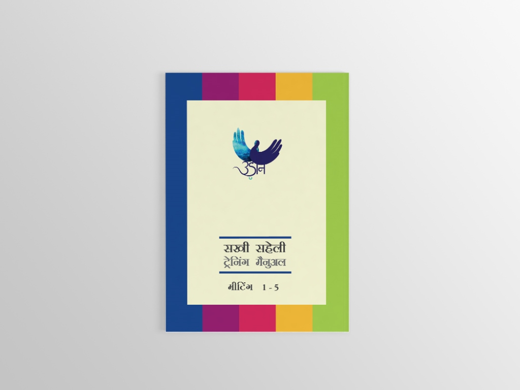
Training Manual Cover
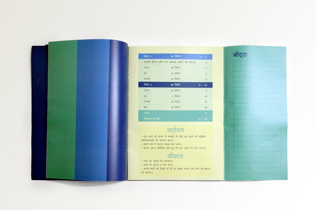
Meeting 1 | Each meeting has an index and a notes tab for better planning and organisation.
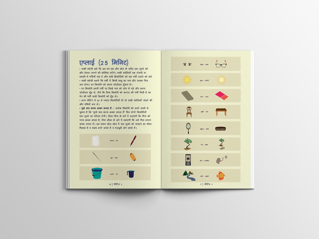
Meeting 1
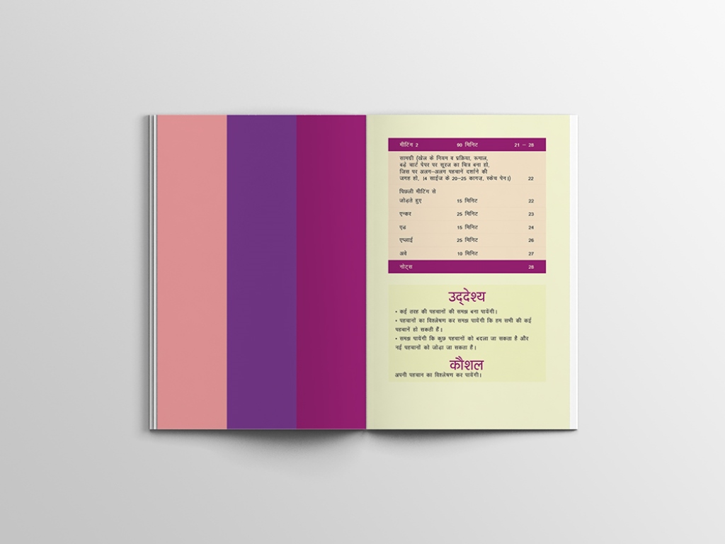
Meeting 2
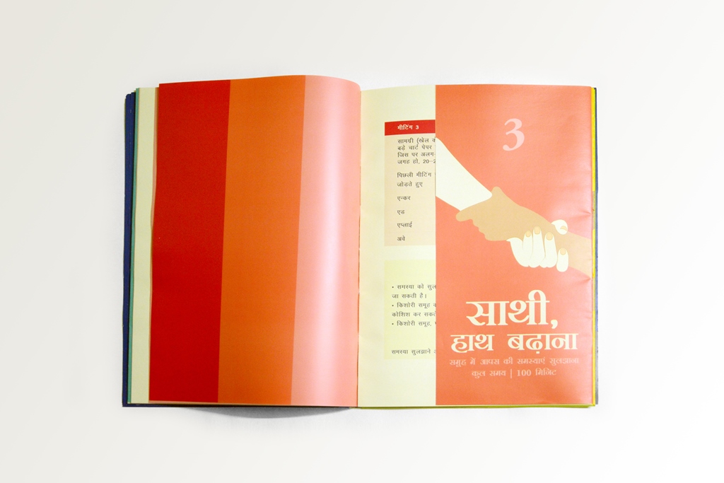
Meeting 3
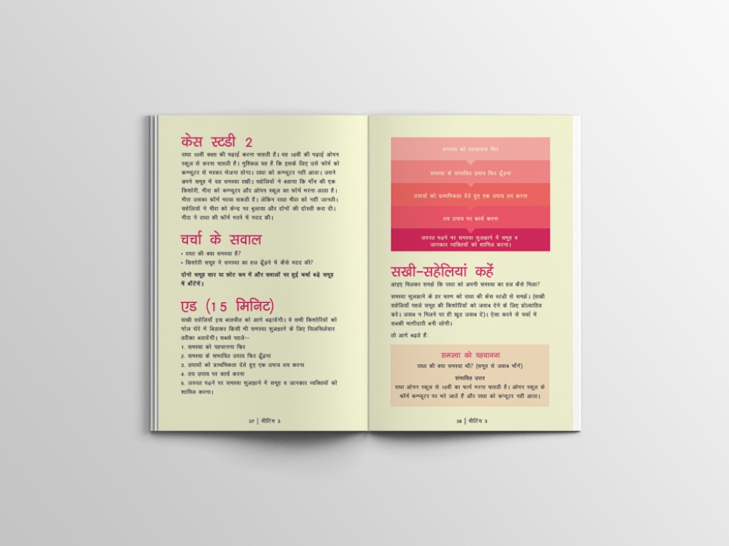
Meeting 3
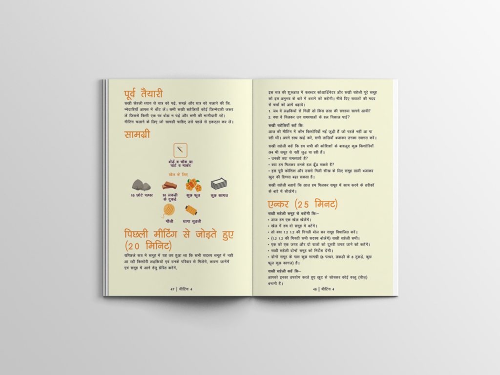
Meeting 4
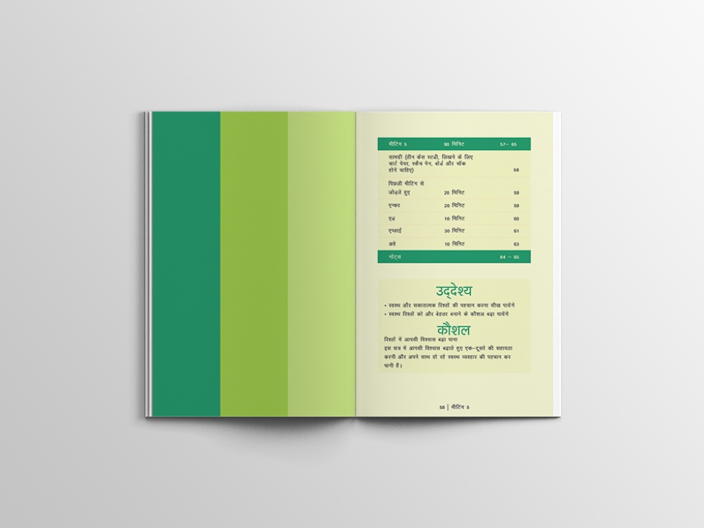
Meeting 5
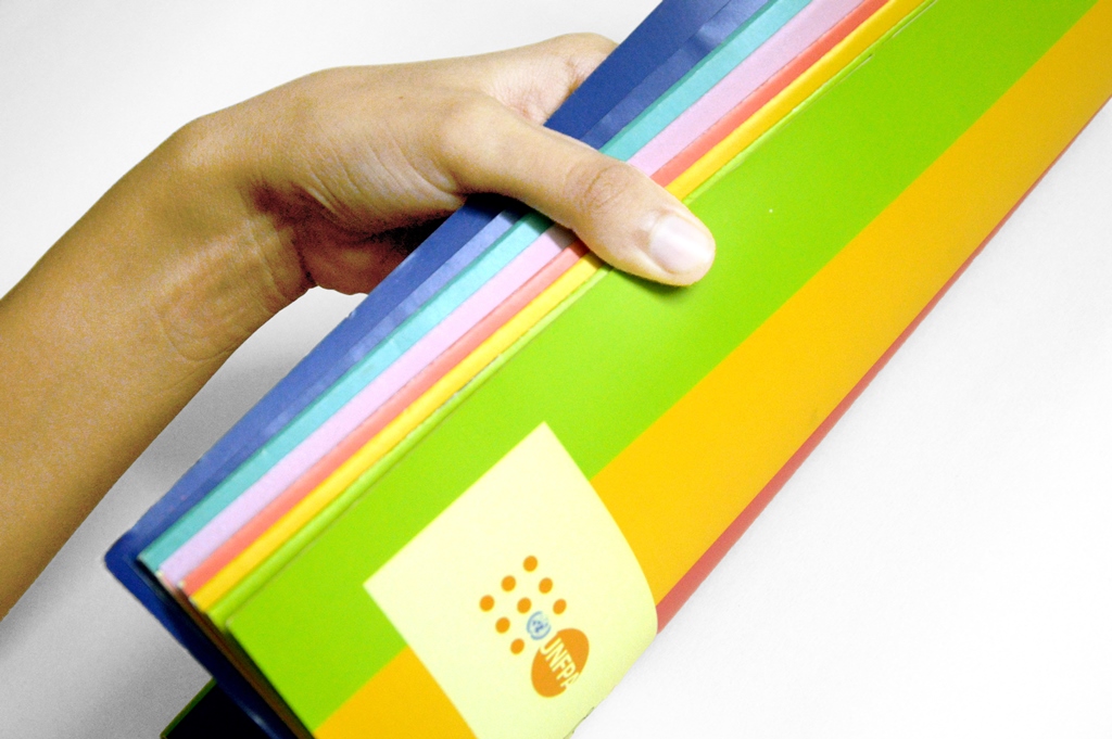
Each meeting as a single colour segment makes it extremely easy for the peer educator to navigate through the manual.
